
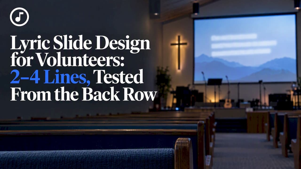
The best lyric slide design disappears into the background: a readable sans-serif font, strong contrast, 2 to 4 lines per slide, and a simple template you reuse every week. Our platform helps your team build, sync, and present those slides without extra fuss. Below, we walk through the practical steps and templates that make it stick, week after week, volunteer after volunteer.
TL;DR:
- Break lyrics into 2 to 4 lines at natural breaths, keep verse and chorus breaks consistent, and use centered blocks unless lines are uneven.
- Use a medium or bold sans serif font, typically 60 to 90 points, and keep one family in the house template for every volunteer.
- Keep normal lyric text at a 4.5:1 contrast ratio; large text can use 3:1, and increasing size may help when text is hard to see.
- Test slides on the actual projector with house lights on, then check a phone photo and the back row; laptop previews can miss color shifts.
- Give rotating volunteers a one page style guide and named templates for verses, choruses, bridges, and outros, then rehearse slide timing before service.
Table of Contents
- Core design principles for lyric slides
- Fonts and typography: practical rules and recommended families
- Backgrounds and contrast: translating WCAG into projection practice
- Layout, lyric breaks, and slide pacing
- Keeping design consistent across a worship set and with volunteer turnover
- Volunteer-friendly workflow and templates
- Accessibility and projection: practical WCAG-based adjustments
- Song7 practical notes: applying these rules without extra training
- Editorial perspective: favor consistency over novelty
- Try Song7 to build, sync, and present lyric slides reliably
- FAQ
- Sources
Core design principles for lyric slides
Legibility starts with restraint. The standard recommendation is 2 to 4 lines per slide, broken by musical phrase or breath rather than by grammar. If a line takes a breath to sing, it probably deserves its own line on screen. This keeps the congregation singing instead of squinting, and it keeps your slide advance in rhythm with the song itself.
Consistent line length and pacing matter just as much as the words themselves. When slides jump between one short line and six crowded ones, eyes have to keep readjusting, and that friction pulls focus away from worship.
Before any service, run three quick checks:
- Distance check: stand at the back row and confirm you can read the text without leaning forward.
- Lighting check: test with the house lights at their typical service level, not with the room dark.
- Sightline check: sit in a few off-center seats to catch anything blocked by beams, speakers, or sound booth equipment.
Fonts and typography: practical rules and recommended families
Stick with sans-serif fonts. Serifs, script fonts, and anything hand-lettered tend to blur or flicker under projector light, especially on cheaper projectors or older screens. Clean families like Open Sans, Montserrat, or Lato hold up well because their strokes stay even at a distance.
A few practical ranges to work from:
- Font size: large enough to fill a meaningful portion of the slide, usually 60 to 90 point depending on your screen size and room depth.
- Weight: medium to bold; avoid light or thin weights, which wash out under bright projector bulbs.
- Tracking and line height: slightly loosened tracking and 1.2 to 1.4 line height keep lines from feeling cramped.
For emphasis, lean on bold weight, a modest size bump, or a subtle color shift instead of switching fonts mid-set.
Pro Tip: Pick one font family for your whole church and lock it into your template so no volunteer has to make that decision on a Sunday morning.
Backgrounds and contrast: translating WCAG into projection practice
Busy photo backgrounds are the most common reason lyrics become unreadable. A solid color or a dimmed, simple photo with a dark overlay almost always outperforms a vivid, detailed image, because the eye stops reading text once it starts reading a picture.

The W3C's WCAG guidance on contrast sets a baseline of 4.5:1 for normal text and 3:1 for large text. A 4.5:1 contrast ratio is the practical floor for projected lyrics, and it maps directly from web design to the sanctuary screen: treat your slide text the way you would treat body text on a webpage, and test it the same way.
Three quick live tests before service:
- Snap a photo of the projected slide on your phone and check if the text still pops.
- Dim and brighten the house lights to see how the contrast holds under both.
- Walk to the back row and confirm the text separates cleanly from the background.
Layout, lyric breaks, and slide pacing
Three layouts cover almost every worship song. A centered block works for most verses and choruses. A left-aligned block suits songs with longer or uneven line lengths, since it keeps the eye anchored on one edge. A chorus-emphasis layout, with slightly larger text or a color accent, helps the congregation feel the lift into the hook.
Break lines where the singer breathes, not where a sentence ends. A line like "Great is Thy faithfulness, great is Thy faithfulness" often reads better split across two lines than crammed into one.
- Keep verse and chorus line breaks consistent across the whole set.
- Reserve chord or notation display for musician-facing screens, and avoid placing chords directly over lyric text, which clutters a congregation-facing slide and slows reading.
Keeping design consistent across a worship set and with volunteer turnover
Consistency reduces the visual friction that distracts a congregation. Mismatched fonts or backgrounds from one slide to the next pull attention toward the screen's design instead of the words on it.
Write a one-page house-style spec covering font, size, color, background treatment, and slide template names. Keep it short enough that a new volunteer can read it in five minutes.
- Save named templates (Verse, Chorus, Bridge, Outro) so operators never build a slide from scratch.
- Give operators a short checklist to run before every service.
- Version your template files so updates do not break last month's setlist.
Novelty for its own sake rarely helps worship; repeatable, modest choices let the congregation stop noticing the screen and start singing.
Volunteer-friendly workflow and templates
A reliable lyric slide workflow follows four steps every time:
- Import and prepare the lyrics, whether typed, pasted, or pulled from a chart.
- Apply your house template so fonts, backgrounds, and spacing match every other song in the set.
- Test on the actual projector, not just a laptop screen, since colors and contrast shift under real bulbs.
- Run a rehearsal check, advancing slides in time with the song to confirm pacing and breaks feel natural.
Save each template component separately: title slide, verse, chorus, bridge, and outro, so a volunteer can assemble a new song in minutes rather than starting from a blank page.
Pro Tip: Build a pre-service checklist that includes a full run-through on the actual rig. A rehearsal test on the real screen catches most mid-song errors before they happen live.
Accessibility and projection: practical WCAG-based adjustments
For people with low vision or contrast sensitivity, the fix is usually simpler than it sounds. The WCAG large-text allowance permits a 3:1 ratio for large text, so increasing font size can sometimes solve a contrast problem on its own, without redesigning the whole slide.
- Raise font size first when text looks small but background and font colors are already strong.
- Switch to a darker or more solid background when the issue is contrast itself, not size.
- Offer a printed lyric sheet or an alternate high-contrast slide set for anyone who needs it, especially during communion or quieter moments when screens may dim.
Song7 practical notes: applying these rules without extra training
Features such as presentation mode, saved templates, and real-time sync help teams apply these rules without redesigning slides each week. Import a song, apply your house template, test it on the actual projector, and save the result as a preset for next time. That loop, repeated once, becomes the standard your whole volunteer team can follow.
Editorial perspective: favor consistency over novelty
Our honest take: a plain, consistent slide design serves worship better than a clever one. Build a simple house style, rehearse the run, and let the words carry the weight instead of the screen.
— Editorial team
Try Song7 to build, sync, and present lyric slides reliably
Building the templates and checks we have described takes real effort the first time, and keeping them consistent every week takes more. Song7 gives your team a setlist builder, a presentation mode built for lyric display, and real-time syncing so every operator sees the same slide at the same moment, even on a phone during a last-minute change.
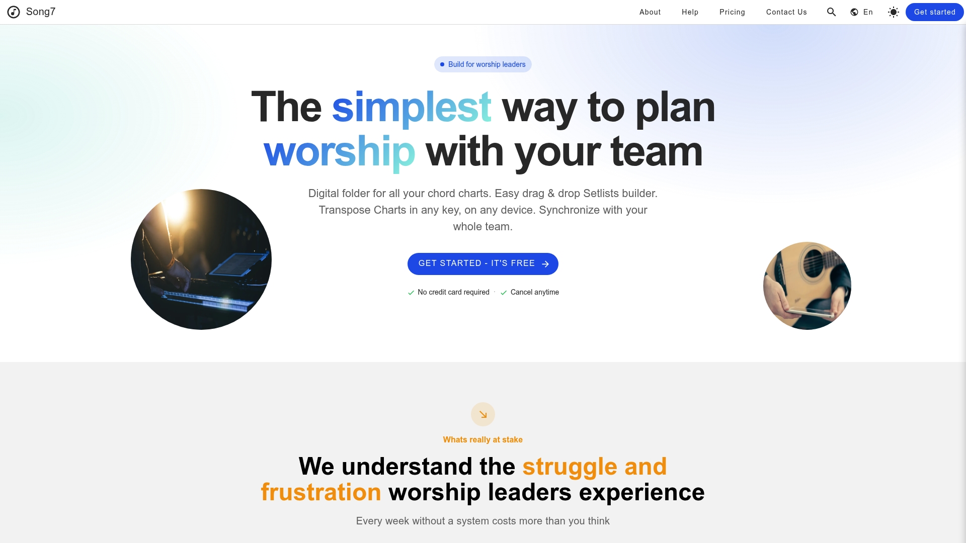
- Build your house template once inside the setlist builder and reuse it consistently.
- Use presentation mode to project lyrics directly from your prepared setlist.
- Sync changes in real time so updates reach every screen at once.
Start by importing one song, applying your template, and testing it on your own projector this week. Visit Song7 to get started.
FAQ
How many lines should a lyric slide show?
Most teams keep lyric slides to 2 to 4 lines, broken by musical phrase rather than by sentence. This keeps the text readable at a glance and matches the natural breathing points in a song.
What font works best for church lyric slides?
Sans-serif fonts like Open Sans, Montserrat, or Lato read more clearly on projection than serif, script, or thin decorative fonts. Medium to bold weight holds up better under bright projector bulbs than light or thin weights.
What contrast ratio should lyric slides use?
WCAG guidance recommends at least a 4.5:1 contrast ratio for normal text and 3:1 for large text, which applies directly to projected lyrics. Testing with a phone photo of the actual projected slide is a quick way to confirm the contrast holds in your room.
How do we keep lyric slides consistent when volunteers rotate?
A one-page house-style spec covering fonts, colors, backgrounds, and named templates helps new volunteers produce consistent slides without guesswork. Reducing that visual inconsistency keeps the congregation's attention on the lyrics instead of the design.
Can Song7 help with building and testing lyric slides?
Our platform offers a setlist builder, presentation mode, and real-time syncing designed to support volunteer worship teams preparing lyric slides. These features support the template-and-test workflow described throughout this guide, from importing a song to projecting it live.
Sources
- 5 tips for better song slides — Logos
- Understanding Success Criterion 1.4.3: Contrast (Minimum) | WAI | W3C
- Consistency is a feature — UWM knowledge base